Generating the logo for this site
I wanted a logo for my blog. Something kind of personal, but abstract; preferably something that could be drawn with a single path. I decided to download an elevation map of the Netherlands (where I live) to somehow use a plot of that data as my logo. I thought it would be nice to generate a side view and smooth it. In this short post I will discuss how I did it.
The data
The Netherlands have an open database containing elevation data for the whole country. It is called Actueel Hoogtebestand Nederland (Current Elevation database Netherlands) and can be viewed online. On average, it contains eight height measurements per square meter. The measurements are made using aircraft with LiDAR technology. Measuring the entire country takes sevaral years. In particular, I used the database called AHN2, which contains measurements made from 2007 to 2012. According to the website, 99.7% of the measured points are accurate up to 20 cm.
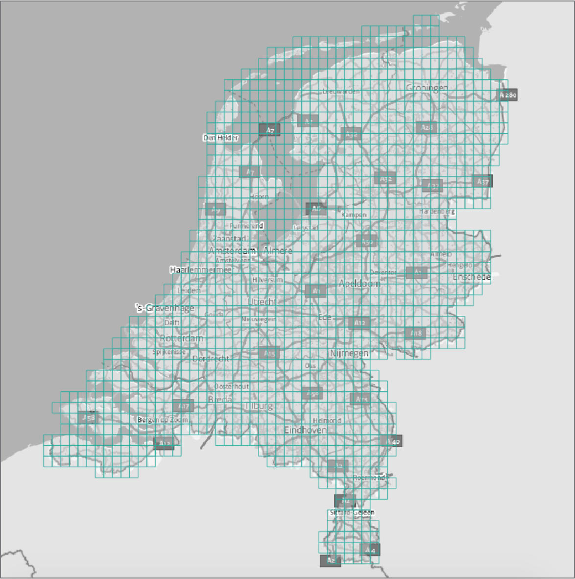
In the database, the country is divided into a grid of around 1300 cells, each having dimensions of 5x6.25 kilometers. For every cell, the measurements can be downloaded as a zipped GeoTIFF file of around 500 KB. Links to these files can be found in an Atom feed.

The code
Obtaining the links to all cells is as easy as reading the contents of the Atom feed and extracting all URLs from it. I chose to extract the URLs using a simple regular expression. Note that in R you need to escape the backslash with another backslash.
library(tidyverse)
feed <- read_file("http://geodata.nationaalgeoregister.nl/ahn2/atom/ahn2_5m.xml")
links <- str_extract_all(feed, "http[:/.\\w]+\\.zip")[[1]] %>% unique
This results in a vector of 1373 URLs.
For every url in this links vector, I download its contents into a temporary file, unzip it, read it into memory as a GDAL object, take its maximum over an axis and remove the temporary file again.
library(rgdal)

# Create temporary folder to store the files in
temp <- tempfile(fileext = ".zip")
# Download the file and unzip it
download.file(url, temp, quiet = TRUE)
unzip(temp)
# Obtain .tif files contained in .zip
shp <- dir(tempdir(), "*.tif$")

# Convert to GDAL and project onto axis
y <- readGDAL(shp, silent = TRUE)
y <- project(y, axis)

# Remove temporary files
file.remove(temp)
file.remove(shp)
I wrap this into a function and run it for every url using plyr::llply(). I like to use llply because it has a progress bar functionality that I find useful when scraping. I set axis to 2, which means that I take the maximum value over the rows (longitude). In the end, obtain a data frame with 1250 values for every cell (6250 meter cell size, 5 measurements per meter). Since there are multiple cells within a row, I have to group this data frame by latitude and take the maximum over each group to get to the plottable result.
Plotting is now an easy task using ggplot.
ggplot(df, aes(x = x, y = elevation)) +
  geom_line() +
  theme_void()
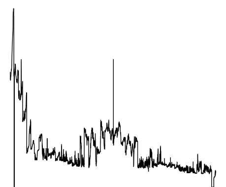
This plot displays the country as if we were standing in Germany and looking at the Netherlands without the ability to see perspective. There are some weird values here and there, but overall it looks like can be expected. It is too rough to use as a logo; we should apply some smoothing to make it prettier.
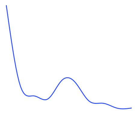
Smoothing can be done in ggplot by simply replacing geom_line with geom_smooth. Under the hood, this is using using cubic regression splines to smooth the values. This yields a pretty picture better suited for using as a logo.
ggplot(df, aes(x = x, y = elevation)) +
  geom_smooth(se = FALSE) +
  theme_void()
Conclusion
That’s it! Once you have an idea, creating your own logo can be a couple of lines of code away.
The complete R code used can be viewed on my Github.